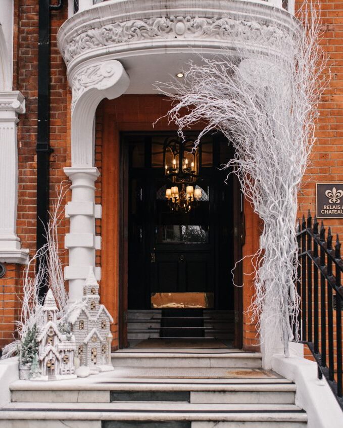
O&A London is an international office of award-winning Russian company Oleg Klodt Architecture & Design established in 2000. Despite the fact that the London branch of the bureau was registered back in 2017 it took Oleg and Anna nearly a year to find suitable office space. They finally chose a building in the style of the French Renaissance located in Belgravia just 5 minutes walk from Buckingham Palace.
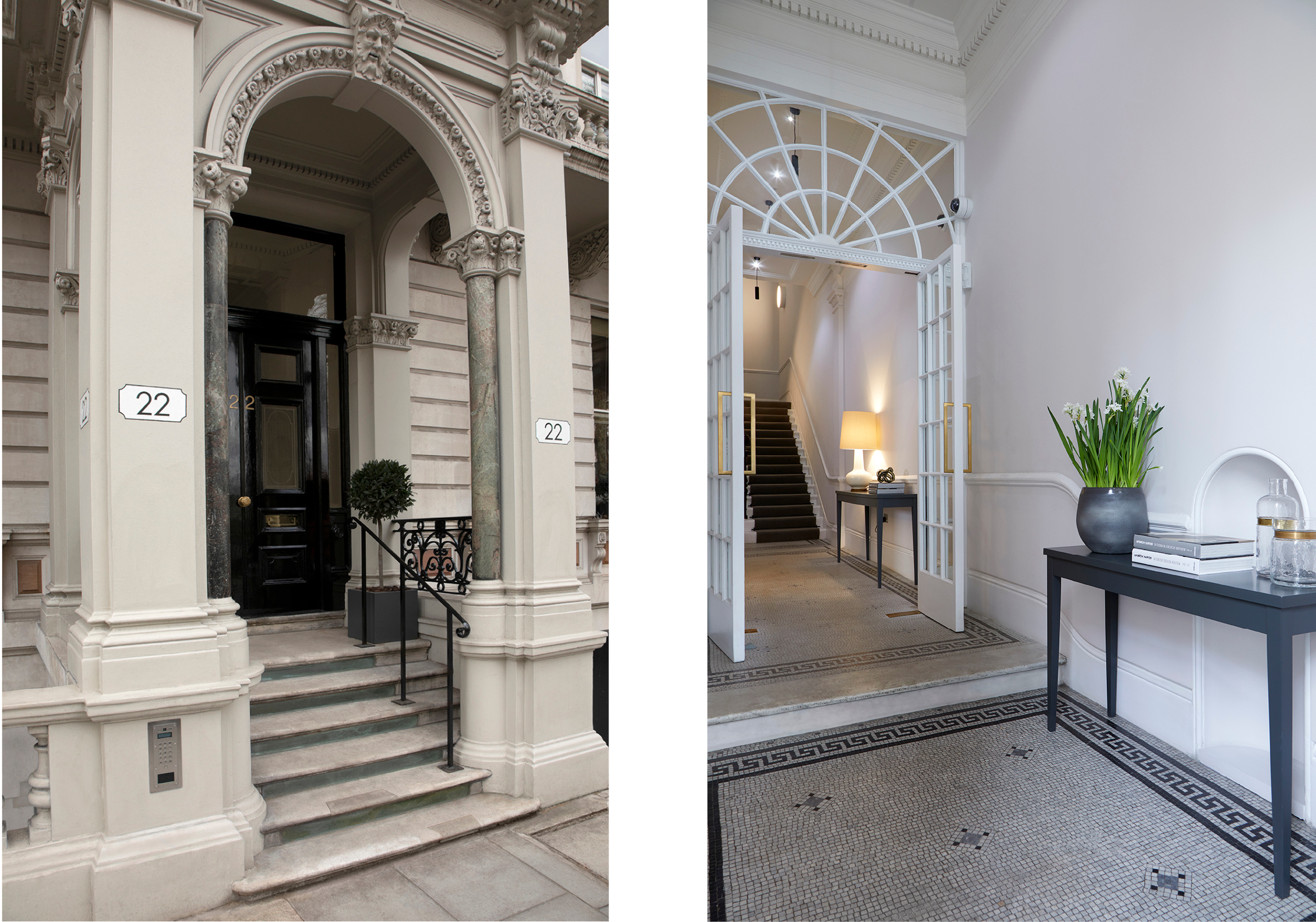
Exterior
Grosvenor Gardens House, built in 1867 and designed by architect Thomas Cundy was the first building in London offering apartments for short- and long-term rent. It was later used as a hotel and today, having undergone reconstruction offers modern office spaces. The company office is 75 square meters and is positioned on the 4th floor of the building. It offers a magnificent view of the historic part of the city with its amazing architecture.
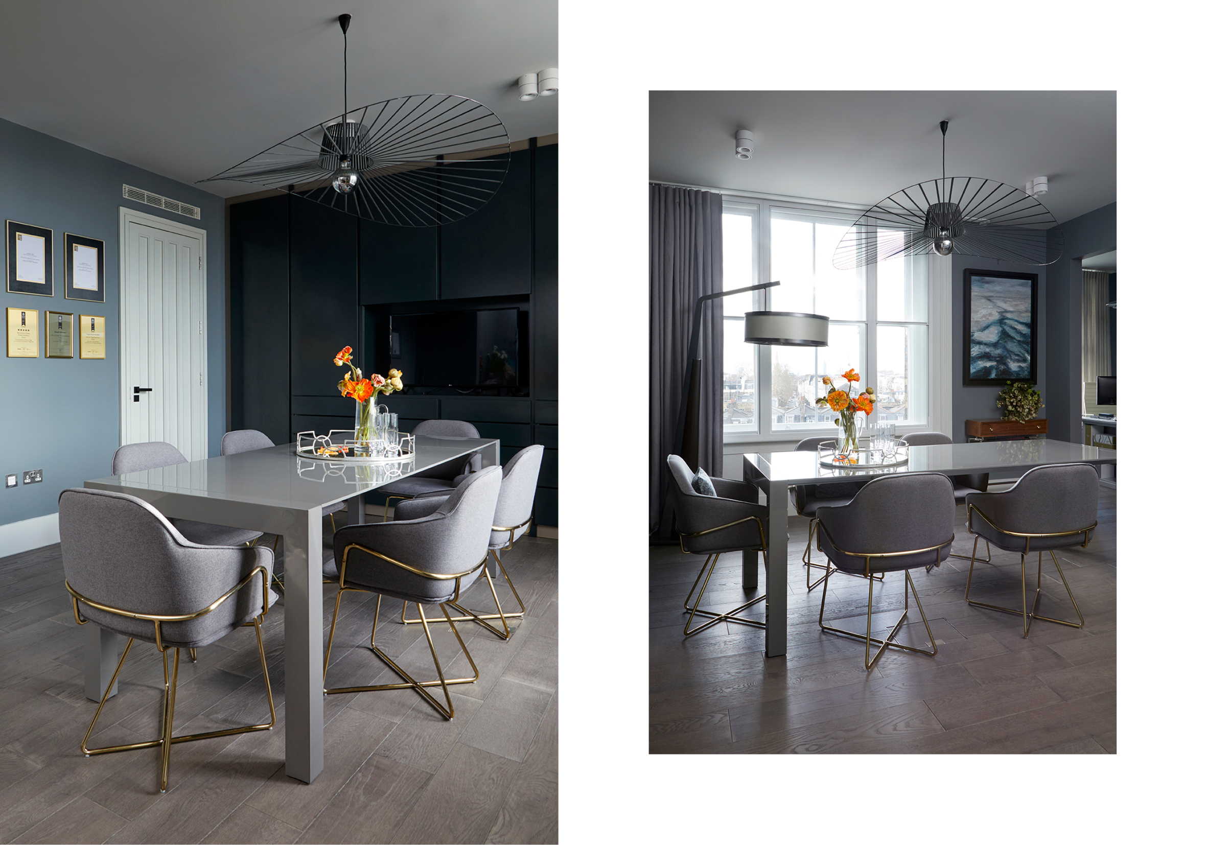
Brief
The designers wanted to create a space which was not only comfortable for everyday work but would also become an ideal background for displaying their interior collections, which architect Oleg Klodt and designer Anna produce under the O&A London brand name. The concept of the brand is in creating art objects which play the centrepiece role in the interior while being versatile and suitable for both classical and modern interiors but at the same time unique, which means they are not replicated or tied to current trends and represent the so-called “timeless design”. Created in 2017, O&A London brand now features a collection of furniture, lighting, textiles, wallpapers and rugs.
The project was completed in just two months, which was as much down to the experience of the designers who were working on the third office for their company. As it was down to the wonderful geometry of the space of the historic building and clear understanding of which items will become the centrepieces of the interior. The designers created an interior that is uncluttered but rich in content.
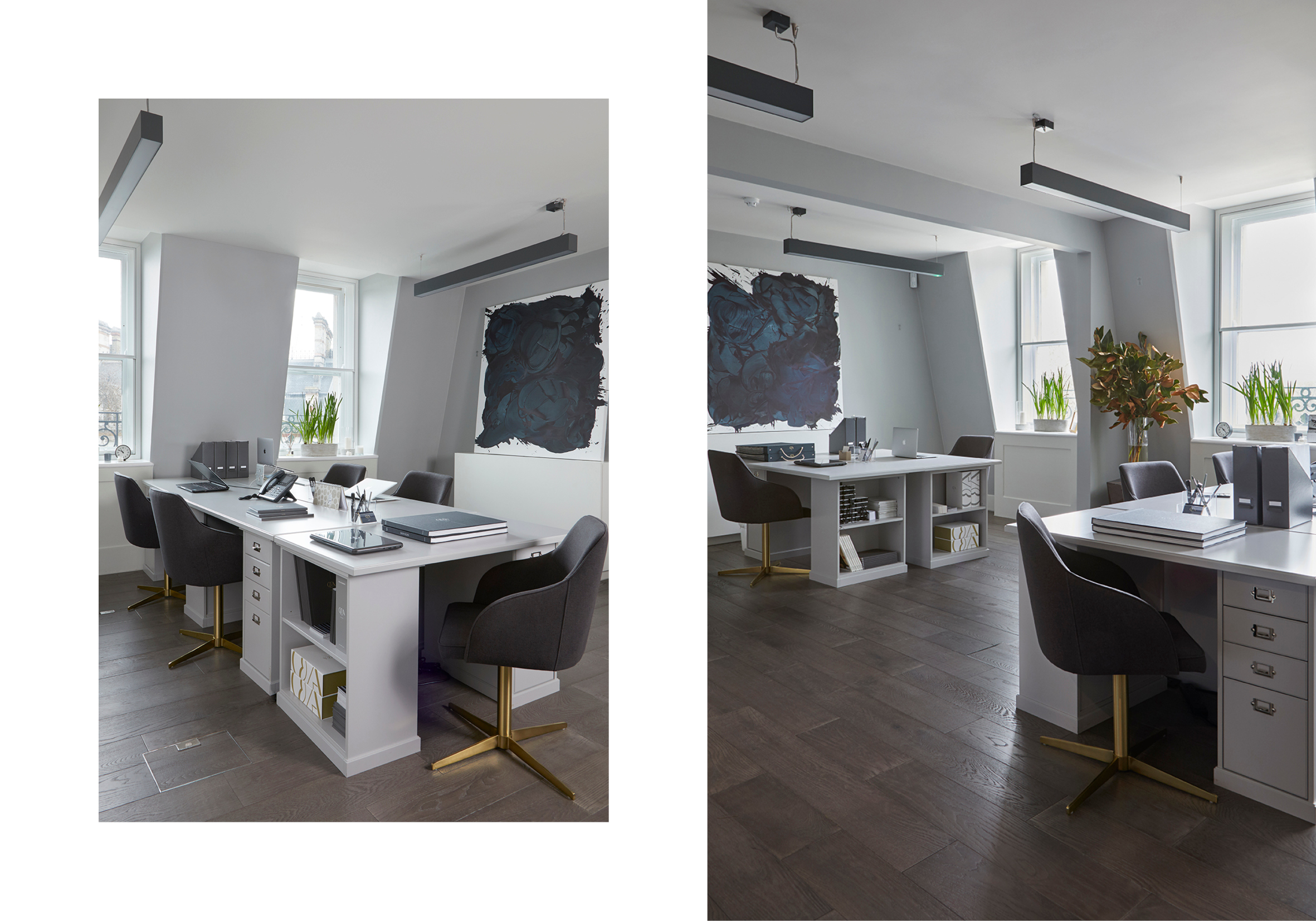
Planning
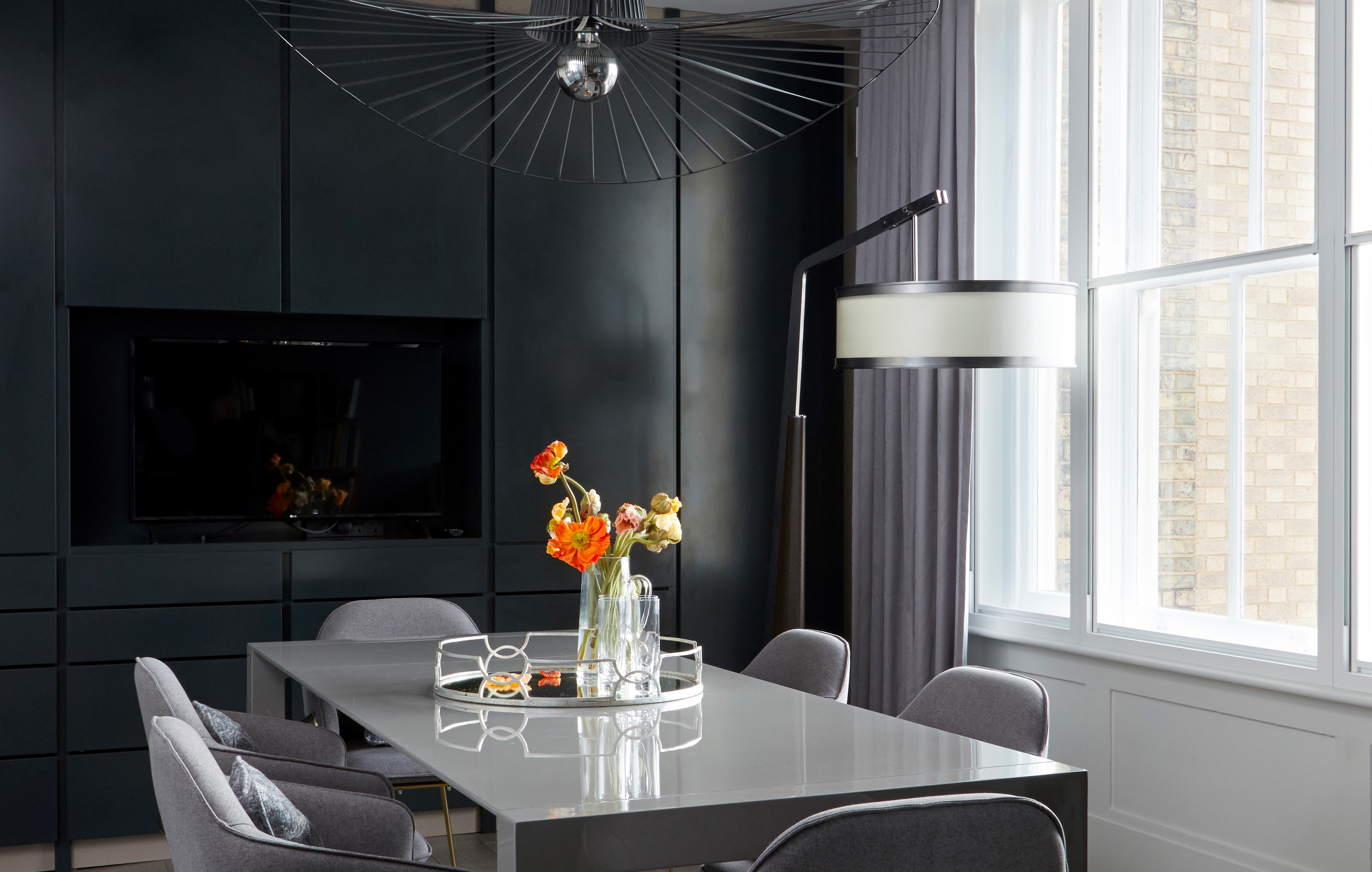
Space is divided into two main areas: a working area accommodating the staff and a display area which includes a sample library and conference room. The working area is completed in monochrome. The designers created a neutral background which makes the works of a British artist Stacey McCormick stand out. Stacey’s paintings are always full of unique movement, so despite the reserved colour pallet, the working area atmosphere is more than dynamic.
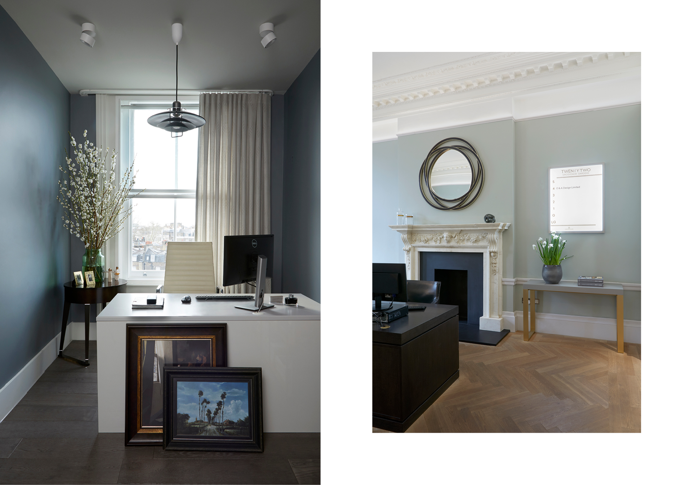
Colours & Furniture
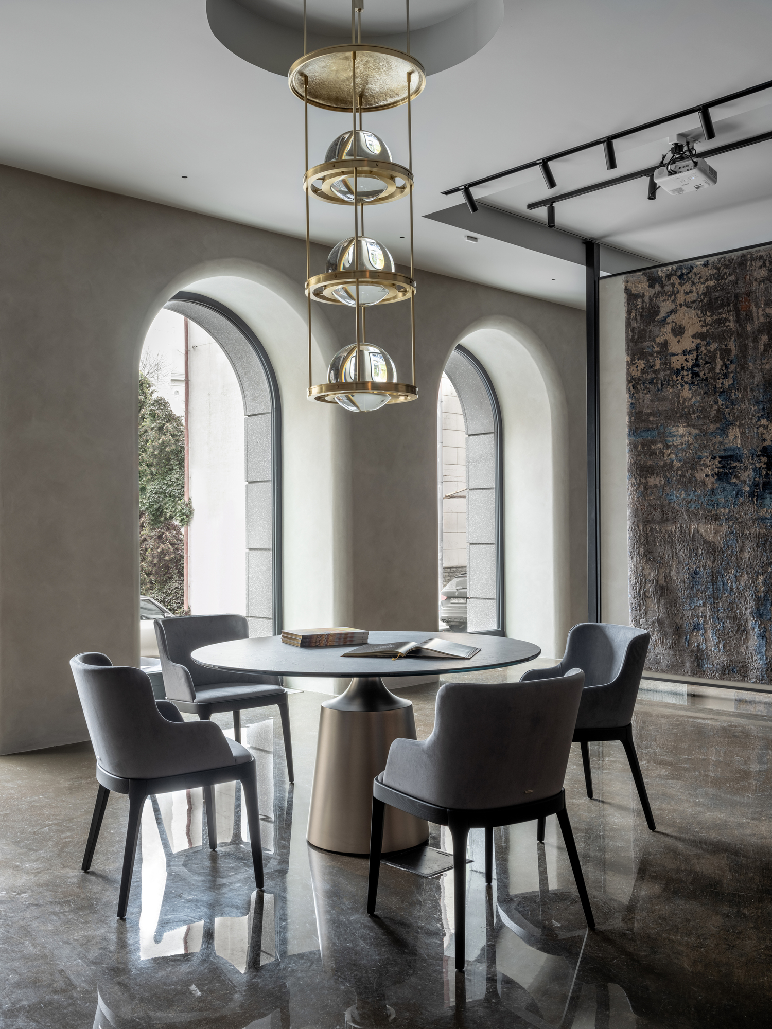
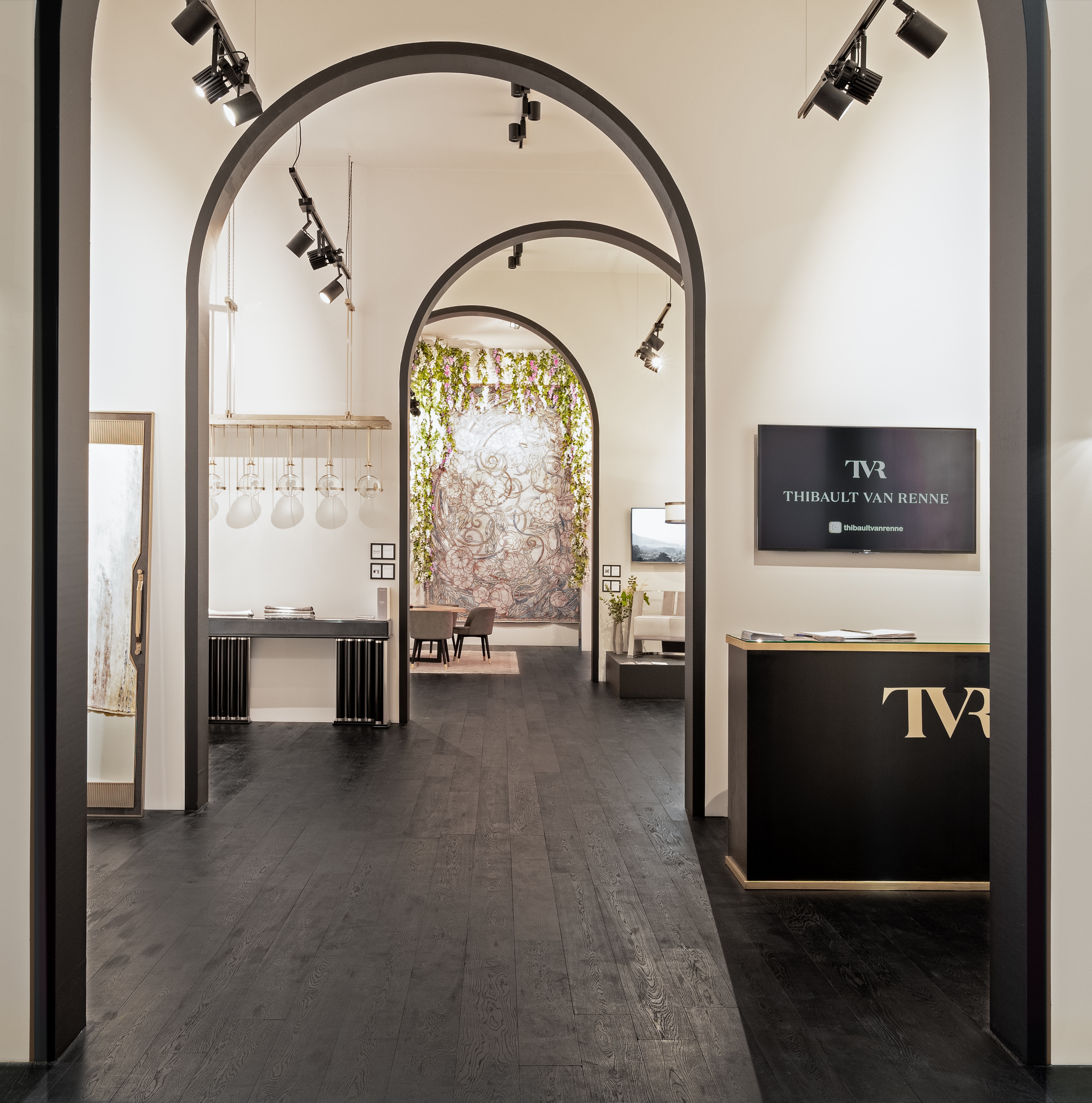
The display area is also very reserved in terms of colour but has a great variety of textures and materials. The designers change the display monthly and add a new piece of furniture to the mix.
In their projects, Oleg Klodt and Anna Agapova don’t only create a movement of space but also fill it by 70% with individual items which they have designed. The London office project was no exception. The new office is a reflection of the bureau’s style – elegant modesty and brand values which have an architectural approach, versatility and impeccable quality at their core.
